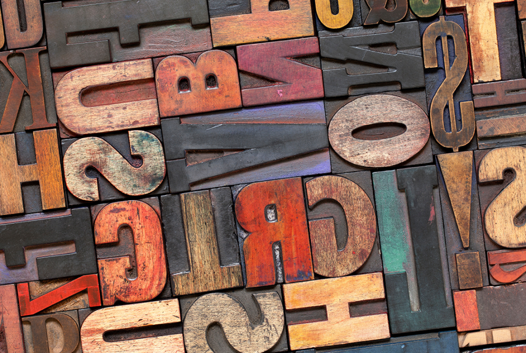
If you opened this blog article and it was written in Comic Sans, would you take us seriously? Most would probably say no. But what is it about Comic Sans that makes it so highly criticized? Simply put, the typography design of Comic Sans is informal and non-professional in presentation, causing anything that is spelled out in this font to be viewed in the same manner. Let’s talk about typography design and its importance in building your brand’s personality.
What is Typography?
Typography is the way in which letters are designed and arranged, with the goal being to achieve legible, clear, and aesthetically pleasing copy for the reader. The style, appearance, and structure of letters and words all contribute to the personality and tone a typography presents.
Is Font the same as Typography?
The fonts you have on your computer are under the umbrella of typography. Different fonts are part of typefaces. Each typeface and its family of fonts contribute to typography design as a whole. For example, you may know the font Arial Narrow. Or maybe Arial Black or Arial Nova. Arial is the typeface, or the overarching term for the entire family of Arial fonts. The weight of each of these fonts and the spacing between letters are just some of the elements of typography.
Elements of Typography Design
What elements make for variety in typography? Let’s talk about some of the basics of lettering and layout that impact typographic design.
Lettering Details
Details of letters themselves impact the style and tone of a typeface.
First, let’s consider letter height. The cap height is the length of the uppercase letters in a typeface. The baseline is where the bottom of a letter falls. Think of lined paper as establishing the baseline and cap height for a typeface’s letters. Anything that falls below the baseline is a descender from a letter.
Between the bottom of a letter and the cap height is the X-height. The X-height is the midway point of a typeface’s total length. Many lowercase letters come to the x-point of the typeface. If letters reach beyond the x-height, this is called an ascender.
When forming letters in a typeface, the stem is the primary stroke of a letter, and a bowl refers to curved letter shape that forms the “hole” of rounded letters.
Layout
Next, the way letters are arranged, spaced, and formatted contributes heavily to typeface design. Here are some spacing and layout elements to keep in mind.
Kerning is the spacing between any two letters in a typeface. Tracking is the spacing between all the letters of a typeface in a word. White space is open or negative space around text or graphics. Think about a document written in single space versus double space. Double space has much more white space.
Alignment is the element of unifying your text or graphics to create clear and equal sizing and spacing. As you continue building your typographic design, hierarchy and contrast are two vital concepts. Hierarchy establishes prominence and distinction between elements. In this blog, there is a hierarchy between the section titles and the copy. This helps distinguish and draw your attention to the main ideas throughout the page. Similarly, contrast is a difference in size, color, weight, or typeface style to build a distinction between two elements.
Each of these elements contributes to building designs and text layouts that make an impact.
The Importance of Typography in Graphic Design
While breaking down spacing and the height of elements may seem nit-picky, typography design is important in graphic design when choosing a typeface style that matches the brand personality and message content that is being communicated.
Typography Design and Branding Success
The phrase “it’s not what you say, it’s how you say it,” holds true for visual communication as much as it does for verbal communication. This is because typography contributes to brand voice and personality.
Brand Personality
Typefaces carry a specific tone or personality to them. There’s a reason you use Times New Roman when writing an academic paper and not Comic Sans or even Century Gothic; objectively, Times New Roman has a more polished appearance.
Think of the typefaces used for cosmetic or beauty brands like Estee Lauder, Dove, or Bare Minerals. These brands all use clean, simple, and gentle fonts that correlate to their brand’s sleekness. You would probably be a little confused if one of these beauty brands swapped their brand’s typefaces for the typeface that Spirit Halloween uses when it pops up once a year. You would feel the same way if Spirit Halloween switched their lettering with that of Bare Minerals. There’s nothing wrong with any of these fonts, this just goes to show that fonts have a way of blending with their brand’s persona.
Brand Recognition
This example also shows the importance of typeface in brand recognition. Even if you can’t name the typeface or perfectly picture the fonts of the brands listed above, when you see the brand’s logo, you recognize it. If Clinique suddenly swapped to a noticeably different font style, you would still recognize the name, but you may wonder if you were getting fooled with a knockoff; with a different-looking typeface, the brand just does not look right. Typography is key to consumers’ brand recognition
Brand Professionalism
In addition to personality and recognition, typography design also conveys professionalism. This extends beyond just your brand’s logo. Choosing typography on your website that is well-spaced and easy to read is important to user experience and can make a difference in the amount of time users spend on your site. Clear and striking typography design draws in consumers’ attention and drives their decision-making toward your product, which ultimately benefits you.
Perfecting Typography
Typography impacts your brand’s appearance in everything from logo design to webpage layout. If you’re looking for a fresh design, FYD is here to help. Our graphic design team can help you choose typography that seamlessly matches your brand’s personality. Let’s get started.
