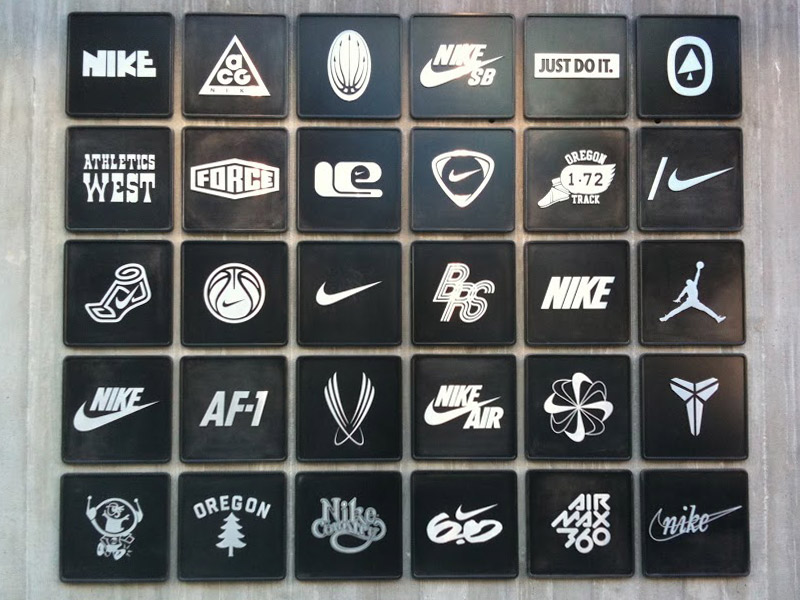
A brand for a company is like a reputation for a person.
Your reputation is comprised of many elements: what you do, what you say and how you present yourself to the world. For a small business a brand style guide lays out the rules for how you’re presenting yourself.
A quick google search on style guides reveals many intricately designed, novel-length books that dictate the exact usage of a logo, and the specific kerning between type. If you’re still figuring out who, exactly, your customer is, and just beginning to think about what features you want on your website, putting together a style guide at this stage might seem intimidating and unnecessary. But it doesn’t have to be long, it doesn’t have to be fancy and you don’t have to be a professional designer to make one.
The mere exercise of creating your first style guide can actually help clarify what’s really important to you, and start to give shape to the words and actions that make up your brand.
Step 1: Start with why
You probably spend a lot of time explaining what your product or service does, but how often do you think about why you do it? A good style guide will start by answering key big-picture questions:
Mission statement: Write one sentence that describes the reason your business exists. You really don’t need more than a sentence, I promise:
Nike: To bring inspiration and innovation to every athlete* in the world.
TED: Spreading ideas.
Google: Google’s mission is to organize the world’s information and make it universally accessible and useful.
Personality: Once you know the why, you need to know the who. Think of your brand as a person. How would you describe them? Sophisticated? Quirky? Down-to-earth? Loud? A dreamer? Write down 3-5 adjectives. Those are the skeleton of your brand’s personality.
Target audience: So you’re now starting to know who you are, but who is your customer? The easiest way to define them is to think about the archetypical person who would use your product or service: how old are they? What’s their gender? What’s their career? Education level? Favorite flavor of Doritos?
Step 2: Make your mark
For people, our mark is our signature—it’s what validates a contract, makes a check cashable and adds value to autographed books. For a company, your mark is your logo.
A logo does not have to be literal. It does not have to have a picture. It doesn’t necessarily even have to have your name (think of Apple or Nike). What it does have to do is represent that personality you described above.
Once you have your mark, your brand style guide explains how to use it. The top three things you should think about are:
1. Where should it appear? Should employees use it in their email signature or does it only appear on the website and business cards? Does it go on every page of a powerpoint presentation?
2. Are there different color or shape variations? Do you want both a stacked version and vertical version? Do you have both a bright green version and a plain black version? Does it always appear with your name, or are they sometimes separated?
3. When should those variations be used? Should your green version always appear on a white background? If you have a photo background, should you always use the black version? On packaging to you use just your logo and not your name, or vice versa?
Step 3: Pick your colors
Color is a personal choice, but it also comes loaded with implications. You may love orange, but are its energetic, cheerful associations right for your company? Refer back to your mission and brand personality.
If you already have a logo, you should probably start there to help define your colors. For help getting started, check out Google’s super helpful color guide. You will want 1-2 principal colors, and 1 or more supporting colors, including at least one neutral or grayscale color. The Starbucks color palette is as identifiable as their mermaid logo.
Your style guide should explain when to use your primary color(s)—e.g. in your logo and packaging—and when to use any secondary colors, e.g. in the body text on your website, or as a background in PowerPoint presentations.
A good brand walks a fine line between consistency and agility: it should be easily recognizable, but open to change as your company grows and develops. Developing a basic style guide gives you a road map to define who you are today, and lays out the route to your business’ future brand identity.
If you have your mission statement, and know what you want to set out to do but need a creative services team to help with the rest… we know who you can contact.
