Whether you are attracting new customers or bringing back old ones, email marketing is one of the most effective ways to reach your targeted audience. When it comes to mobile, however, there are a number of things to consider.
Mobile users don’t think or act the same way as desktop users (as we’ve touched on in a href=”https://fyd.agency/micro-moments/”>previous articles). When designing your email campaign, here are a few things to keep in mind…
Email Marketing Strategy – Keep it simple
The need to lay out complex ideas are why we build websites. Emails, on the other hand, should grab attention and give the reader a reason to click through to your website. Emails that display incorrectly on mobile are deleted within as little as three seconds.1 Unless your subscribers expect lengthy messages (which is possible), stick only to major points, simple imagery and minimal links.
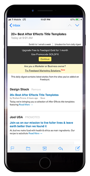
Here’s an example from FeedSpot which shows us three things to beware of:
- Content – Including the author and timestamp for each article is unnecessary. It clutters up the content and serves no purpose in the goal of getting readers to click through.
- Imagery – There’s not much to look at here. Granted, Feedspot is a site only meant to share trending topics. But incorporating imagery to help the message goes a long way.
- Links – There are at least six links to choose from before even scrolling down. Too many options will more likely lead to overwhelming readers than click-throughs.
Email UI
Your email design should be a professional, branded template that is consistent with each campaign. This helps guide users to the content and contributes to brand recognition.
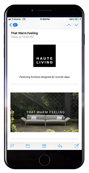
The team at Haute Living give us a great example:
The branding and layout are consistent with the campaign; it’s well-sized; colorful; the content is concise as can be; and it displays great on mobile. Also note the relevance throughout. Not only in the products listed, but the overall topic given our recent deep freeze in the Chicago area.
Tell a story
Every great story has an arc. Where does your story take your audience?
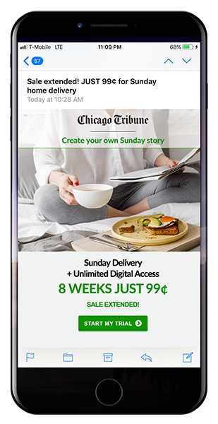
This Chicago Tribune email is a good example of this beginning-middle-end concept.
The subject line starts the audience off with an eye-catching deal. The image inspires sentimental feelings toward holding a hard copy newspaper. Finally, the story concludes with a specific message on subscription and additional benefits. This message quickly and seamlessly brings readers through the story Chicago Tribune is trying tell.
Call to Action
The more you know about your audience, the more effective your mobile email marketing will be. In particular, know what inspires engagement from your audience. If you follow what users are searching for, you should be able to craft meaningful content with ease.
Look for ways to serve up a quick call to action:
- Use this coupon.
- Join us this weekend.
- Watch this quick video.
But keep in mind, you want to limit the number of options presented. The idea of a call to action is to direct the audience to learn more via your website.
Don’t forget the data
You’ve crafted the perfect email campaign. A simple layout with specific calls to action, captivating imagery, and a great story. Now send! Right? Don’t press send just yet. Ensure your award-winning work is backed by a tracking mechanism so you gain insight into how readers interact with your emails (i.e. open rates & click throughs). Most email marketing platforms these days have this baked in, but if need a free tracking tool try out Google’s Campaign URL Builder.
Questions or comments? Let’s chat!
1. Source: Campaign Monitor

 Click to Enlarge
 Click to Enlarge
 Click to Enlarge

