Redline Photo is a leader in midwest motorsports event photography. They approached me with a new brand challenge for their first ever motorsports event that would have a cohesive look with their current identity.
The target
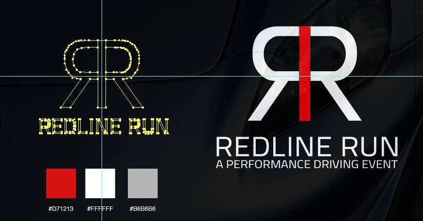
Given the audience RLP has grown within the motorsports world they knew that designing a brand that would be similar to their current identity would only help inform their audience of who is behind their event and lend credibility that it’s Redline behind it. With that I suggested “Redline Run” which would allow for a simple logo mark much like the company logo and describe what the event is in a straightforward fashion.
The design
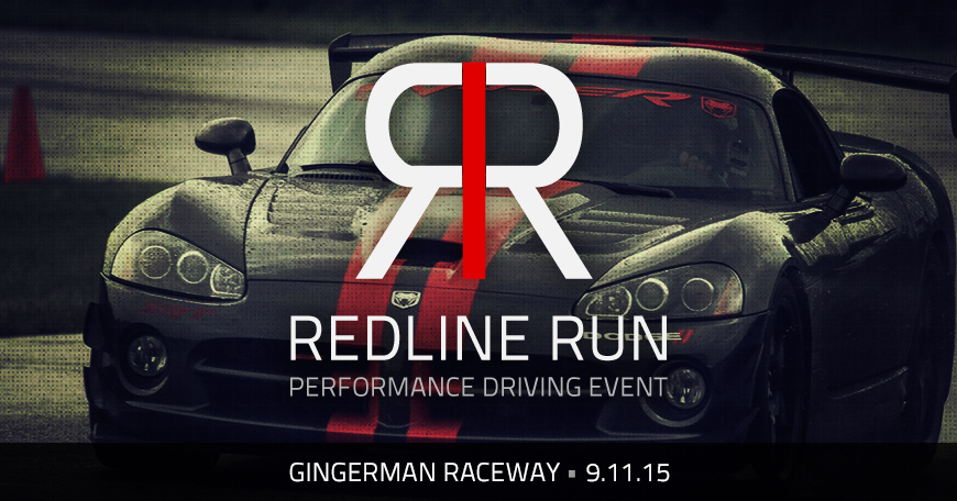
In keeping with the same font and color scheme I knew that advertising assets could be overlooked so we set out to create a style with the imagery we used for social media assets to ensure that each would stand out and draw users into the information. Saturated and vignetted styled imagery is the overall theme I chose for social media promotion. This allowed for the simple red/white logo to “pop” more and draw attention to the new brand mark.
As for videography, I wanted to create “suspense” in leading up to the event. Since it’s the inaugural event the idea of capitalizing on the “what’s it all about?” factor seemed like a fun theme to build off of. With short teaser footage and the right audio backing I felt it would gain more of a response and leave their audience wanting more.
The response
Event branding is an exciting challenge that requires focus on visuals and messaging across all mediums. By continuing to tweak and update the focus of messaging we started to see interest grow and social media has been the biggest player for advertising. If you’re up for a fun day at the race track consider joining us there!


