
How are you reading this? From your desktop? Maybe on your phone or tablet? Either way, is the text big enough? Sized appropriately for the screen? With fast site speed? We hope so. Because if it wasn’t, you would probably leave. Creating a site that is not only accessible on desktop but that is also mobile-friendly is essential to overall website development and success.
We want to highlight what it takes to execute a mobile-friendly website and provide you with tips for success in an ever-changing web development landscape.
What Does Mobile-Friendly Mean?
Mobile-friendly means your website is efficient and functional when accessed on a mobile device like a smartphone. As trends in development constantly advance and update, mobile friendliness requires research and dynamism on behalf of the developer to stay up to date. For example, Google regularly updates how they rank sites based on mobile responsiveness. There are also new advances in user experience layouts each year, as well as increased response times on pages to stay ahead of the competition.
Keeping up with changes is key because mobile friendliness is now more important than ever, thanks to the rise of mobile.
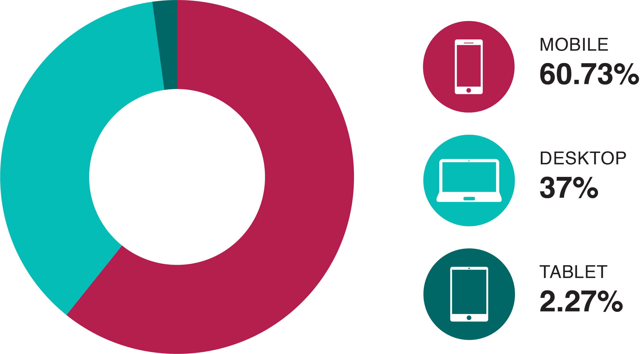
In July 2022, 60.73% of worldwide searches came from mobile devices. Only 37% came from desktops and 2.27% came from tablets. In addition, 96.2% of people aged 16 to 62 own smartphones, but only 63.1% own a laptop or computer. Chances are if your target market is going online, they’re doing it on mobile. So, putting your best foot forward on mobile matters.
Mobile-Friendliness in 2022: Why it Matters for SEO
Recently, Google has increased the impact of mobile-friendliness on SEO. A mobile-friendly website benefits your business’s site significantly when it comes to acquiring traffic and optimizing user experience. Your mobile pages’ layouts, content, and site speed are other contributing factors to SEO, bounce rates, and ranking.
How Mobile Websites Affect SEO
Today, your mobile site is Google’s primary reference point for your site as a whole. Mobile-friendliness began gaining importance in 2015 when Google announced their first mobile-friendly update. This change penalized non-mobile-friendly sites by ranking them lower than mobile-friendly sites in mobile search results. Back in 2015, desktop search was still outpacing mobile search, so this wasn’t incredibly impactful. However, fast forward to 2017, Google began mobile-first indexing. This switched the way sites were ranked on Google. Google now prioritizes the content and site speed of the mobile website over that of the desktop version.
Now, when Google crawls your site, it will look at your mobile version first. With solid mobile content and layouts, both your desktop and mobile website will be bolstered in Google’s rankings. Lacking on mobile will hurt your overall SEO performance.

More about Mobile Websites
Some additional factors on Google’s rankings include your mobile website’s user experience, page performance, site speed, and content quality.
A responsive web design is the key to smooth and simple UX. A responsive web design means your content is scaled to fit whatever screen it is displayed on, whether it be a smartphone or laptop. In the same way that Google is putting mobile first for indexing, your website should also be built with mobile in mind. Ensure that mobile users can quickly and easily find what they are looking for with clear, simple formatting. Hyperlinks and buttons should be spaced apart to avoid misclicks, and while animations and pop-ups are enticing on desktop, they can take away from the ease of mobile.
Quick loading and response times are also vital to low bounce rates on mobile. The saying time is money is true for site speed, which is why many developers are turning to Accelerated Mobile Pages (AMP). Sites that use AMP typically take about 2 seconds to load compared to the typical 22 seconds of a non-AMP site. Although 22 seconds is still pretty fast, when it comes to load times and site speed, every second counts. Amazon has reported that for every 1 second of additional delay in page loading, they lose 1% of sales. When 1% of your sales is equivalent to $1.6 billion per year, that’s pretty significant.
Finally, SEO is heavily dependent on your site’s content, specifically on how relevant, current, and quality it is. Regularly updating a well-designed mobile website with valid information will heavily contribute to your site’s success.
Developing a Mobile Website
Knowing what your mobile website needs to be successful is one thing but having the tools and layout to execute it is what makes the difference.

Google Tools to Use
Google offers tools to help you check if your existing mobile website site is mobile friendly. By plugging your URL into their Mobile-Friendly Test tool, Google will crawl your mobile website, report on its mobile status and site speed, and inform you of any issues to improve upon.
Google also allows you to check your site’s Core Web Vitals, and provides suggestions for optimization on both mobile and desktop. These vitals, Largest Contentful Paint (LCP), First Input Delay (FID), and Cumulative Layout Shift (CLS), contribute to overall UX and therefore impact your SEO and ranking. Improving these vitals helps improve your site speed as a whole.
Development Details to Optimize Site Speed
Regarding layout and development, some aspects to consider while building or modifying a website for mobile include asset management (i.e. CSS, Javascript, images, etc.), hosting, and responsive design.
Pick an appropriate web host based on your site’s size and expected traffic. You may also consider your budget and needs from a hosting provider. The goal is to choose a host that is high performing and consistent with minimal downtime. A new common metric that Google takes into account is TTFB, or Time to First Byte. This is the amount of time it takes a user to initially connect to the server where the website is hosted. Any connection that takes longer than 1 second reduces the performance ranking of your website.
The rule of thumb with things like plugins and images is to keep them light. Choose plugins that minimize the drain on your website’s resources, and be cognizant of how many plugins you use, as overuse may slow your site. Large images can also be a culprit in slowing site speed. Compressing them reduces the file size while maintaining quality. Another method of ensuring that images don’t negatively impact site speed is lazy loading. Site speed is optimized because images appear only when they are scrolled into view.
Finally, be sure to size and place pop-ups and buttons appropriately so they do not hinder accessibility to other navigation tools. Pop-ups are a great way to collect things like email subscribers. However, poorly designed ones that are difficult to cancel impede UX, impact site speed, and increase bounce rates.
We Can Build It
If you would rather skip the coding crash course and development debrief, FYD can take care of building your business’s site. We will bring our attention to detail in development, layout, site speed, and content development to create a mobile website that rises through the rankings. Reach out to us with your vision.