Color. From logos to graphics, webpage design, and promotional content, color marketing plays a role in product success. And at the core of color marketing is strategy; strategy for what color looks best, what color is most memorable, how colors make us feel, and how colors make us act. Out of the 10 million colors that the human eye can perceive, how do you go about choosing the perfect palette for your next project?
Picking Paints: Why Does Color Marketing Matter?
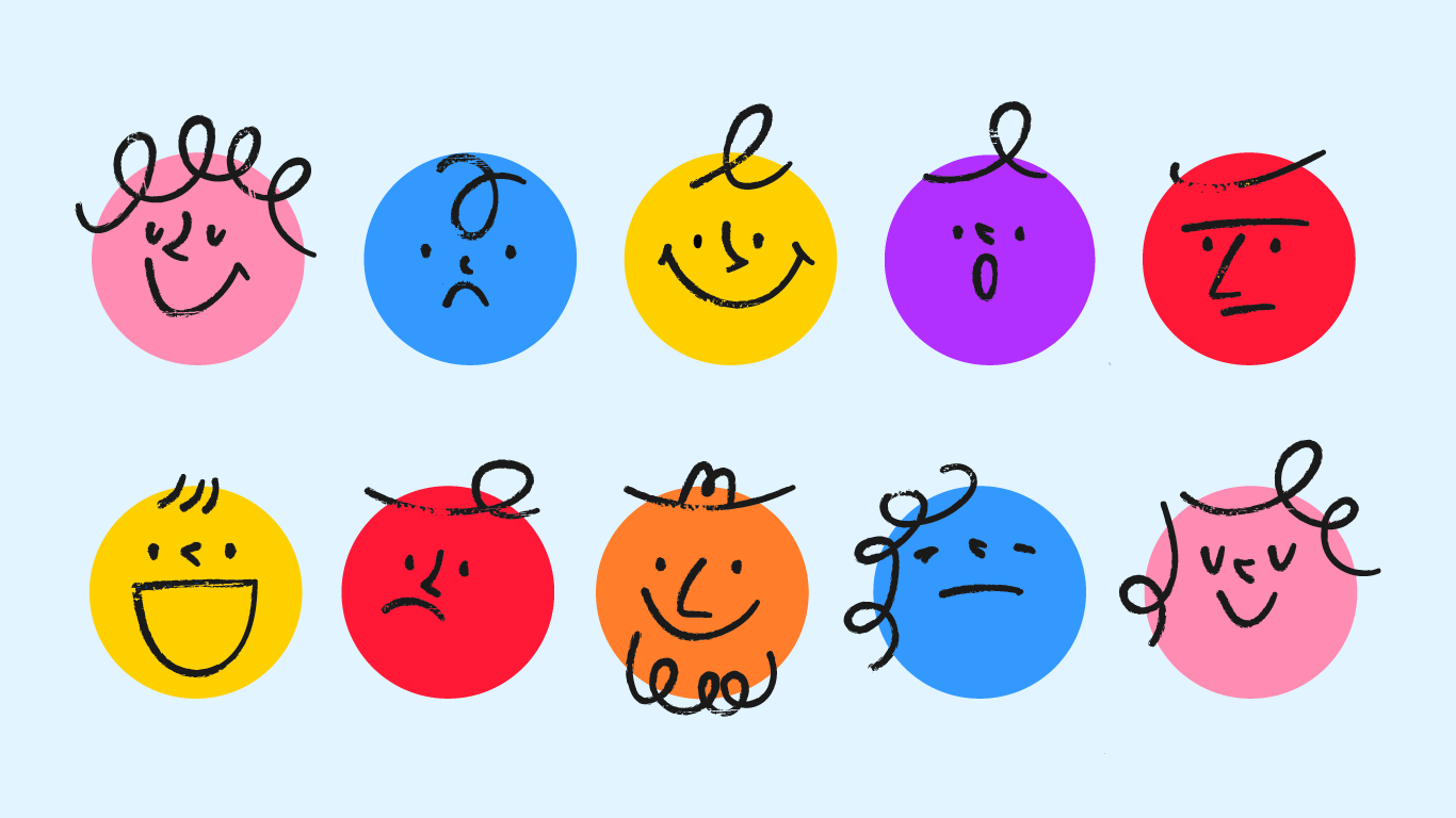
Feeling Blue, Green with Envy, and Tickled Pink–Color has the power to make us feel.
Before our mind takes the time to read or process words, color elicits an unconscious response in the brain. Not only do our brains see color first, the tones we see cause quick reactions. When first interacting with a product or service, it only takes our brain 90 seconds to make a decision, and color alone can influence as much as 60% of the decision to accept or reject a product. The main reason for this quick reaction is the general connotations we have about color, which we then apply to the product or company itself.
In a study that asked participants to share their experienced emotions after viewing 30 different-colored promos for the same product, it was found that respondents shared similar emotions from viewing the same colors. Additionally, these emotions matched what the promo designers expected them to feel based on generally-accepted associations between color and emotion.
What does this mean? Color marketing allows marketing professionals to leverage the common emotions linked with color to help persuade an audience. For example, warm colors such as yellow, orange, and red combinations relate to cheerfulness and happiness, while cool colors like blue, green, and purple tones tend to be associated with relaxation and calm.
More specifically, the color red can stimulate appetite, the color blue can induce calm, and the color gold may cause people to spend or tip more.
Honing In on Hues: Subjectivity in Color Marketing
However, color marketing is not one size fits all. Color connotations and constructs vary across cultures. This is important to keep in mind as you consider your audience. Let’s say you’re branding for an up-and-coming wedding planning company. Tailored toward a Western audience, you may choose white as a prominent color in your design for its association with purity, perfection, and the traditional color of brides’ dresses.
Now let’s say the company takes off and goes international, specifically adding branches in Asia. Your perfect color marketing of white in Western countries is now marketing to an audience whose brides don’t wear white, but red, on their wedding day. And what do those in Japan and China associate white with? Mourning.
The moral of the story: There is more to colors than the associations you may have personally assigned to them. You may see a specific shade of red and yellow together and think American fast food conglomerate, while the person next to you may see the same color combo and think nobility and longevity. This isn’t to say that there aren’t some generally agreed-upon meanings within color marketing, but there is more to color than what meets the eye.
Tips on Tints: Advice for Color Marketers
With the logistics of color in mind, what does this mean for accomplishing successful color marketing tactics?
Branding
Color is ever important to brand recognition. Consumers subconsciously and consciously recall brands by their color alone. In choosing color for logo and brand design, it is important to assign colors that attract customers’ attention aesthetically while also matching the culture and personality of a brand.
Design
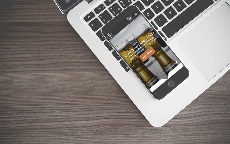
With color and design, less can most certainly be more. Whether you’re designing digital graphics or printed pamphlets, it’s important to find the balance between dull and overstimulating. Crafting a combination of 1-3 core colors while working in base neutrals- such as gray, white, and black- can entice your audience without becoming overbearing with color. And don’t forget the importance of brand recognition. Choosing colors that match your brand image and keep consistency in design is important to prolonged success.
Social Media
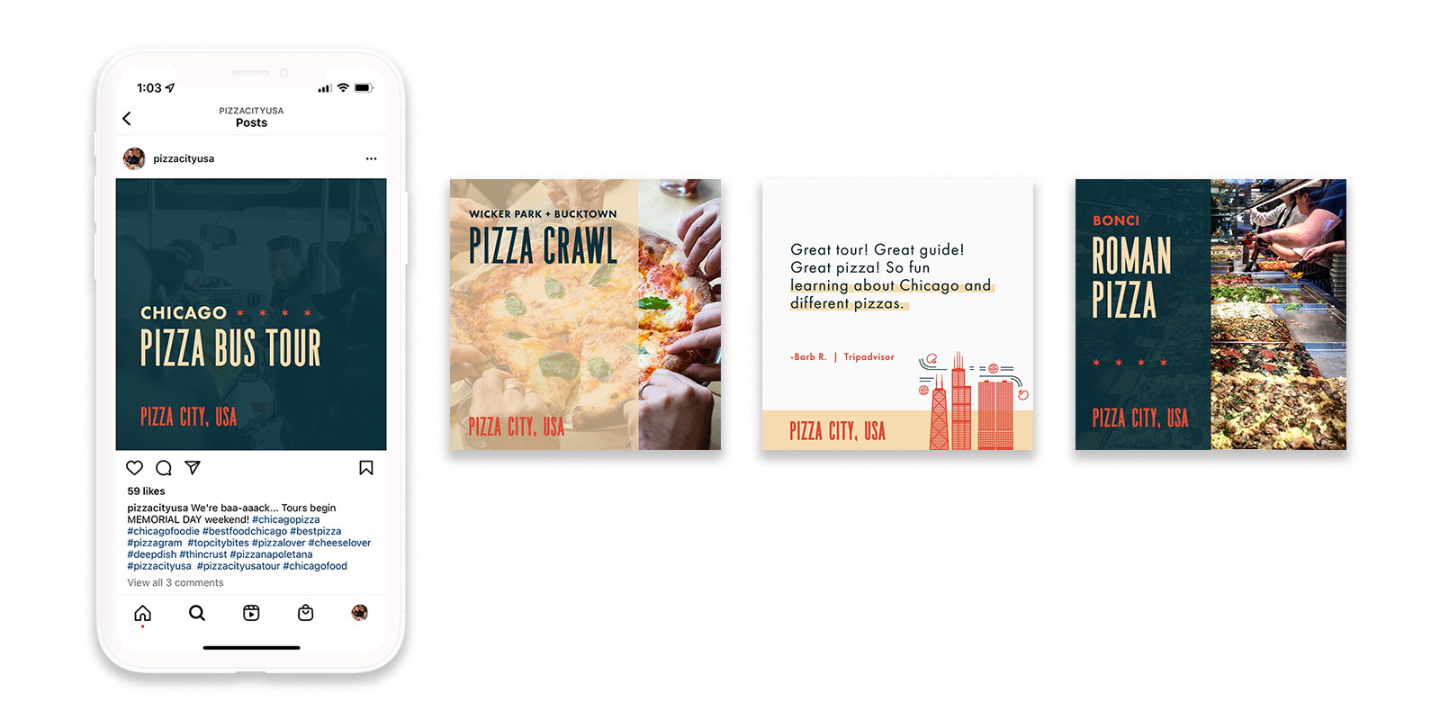
Color plays an extra important role on social media due to the high-speed scrolling and minimal text associated with these platforms. Aesthetics and color are a big factor in what causes people to stop scrolling and engage with content. Interestingly enough, studies have shown that the color blue aggregates more likes and comments on Instagram posts related to art and culture. Similarly, posts about cities see higher performances when presented with yellow-orange hues. Color has the ability to attract viewers and excite them about what they are seeing, resulting in likes, comments, and overall successful social media campaigns.
Staying Current with Color
Lastly, like anything trendy, colors come in waves. Remember the bright oranges and pinks of the 80’s? Definitely not the same as the natural and green hues that are surging in popularity today. Like any trend and technique in the marketing world, it’s important to keep progressing; be mindful that building a brand around today’s hot color scheme may not carry over five years from now. Nonetheless, color will stay ever-present in the marketing world around us.
References
Bleicher, S. (2012). Contemporary color: Theory and use. Cengage Learning.
Hajdú, N. (2021). Importance of colour marketing in the evolutive marketing concept. Multidiszciplináris Tudományok, 11(5), 288–293. 10.35925/j.multi.2021.5.31
Stone, L. T., Adams, S., & Morioka, N. (2008). Color design workbook: A real world guide to using color in graphic design. Rockport Publishers.
Lee, N. Y., Noble, S. M., & Biswas, D. (2016). Hey big spender! A golden (color) atmospheric effect on tipping behavior. Journal of the Academy of Marketing Science, 46, 317-337. 10.1007/s11747-016-0508-3
Macarthy, A. (2015). 500 social media marketing tips. Andres Macarthy.
Rimmer, K. (2021, December 14). 8 color trends for 2022: From pastel gradients to Y2K-inspired metallics. Envato. https://www.envato.com/blog/color-trends-graphic-design/
Udomsin, K., Ruxaitoon, K., & Lertrusdachakul, T. (2018). Color information analysis that influence psychology on digital media design. 5th International Conference on Business and Industrial Research, 200-203. doi: 10.1109/ICBIR.2018.8391192.
Yu, C.-E., Xie, S. Y., & Wen, J. (2020). Coloring the destination: The role of color psychology on Instagram. Tourism Management, 80. https://doi.org/10.1016/j.tourman.2020.104110.